IAM / User registration
I redesigned how admins configure sign-up in an identity product.
Setting up sign-up on our identity platform took admins about four times longer than on competing platforms, and Sales estimated more than $150k in opportunities slipped away in live demos. I led the redesign: every setting in one view, a live preview of the form beside it, and each feature’s options in a panel on the same page. A working prototype won stakeholder buy-in to build and ship it.
Why it mattered
A routine setup task raised a bigger question.
Every app on an identity platform starts with sign-up. Before a single user can register, an admin has to decide what the form asks for, how identities are verified, which social providers appear and where people land afterward. Every new app repeats that work, so a slow setup costs time again and again.
Then a customer told us it was taking their admins far longer than it should. Against competitors’ platforms, the gap was roughly 4x.
I was leading design, with a team of two engineers. These admins had to repeat a slow task for every new app they launched, and I wanted to understand what that was like for them before proposing anything. So we set out to learn two things: what was actually eating their time, and whether it mattered beyond the admins themselves.
Slow setup was costing us customers before they signed.
A 4x gap is a poor experience, but a poor experience isn’t automatically a business problem, and business problems are what stakeholders fund. So the first job was to find out whether this one was worth fixing, and to make that case before designing anything.
Existing customers weren’t the risk. Moving an identity system is a bigger headache than tolerating a slow setup, so nobody was going to leave over it. The real question was about customers we hadn’t won yet: did a slow setup change whether they chose us at all? We suspected it did, and our Sales team confirmed it.
The proof was in our own live demos. To show a prospect how sign-up works, Sales had to configure it across several screens, save, and run the flow to see the result. When something looked off, they went back, fixed it and ran it again, in front of the people choosing between vendors. Prospects read that as a preview of how their own admins would struggle, and it counted against us. Sales put the cost of those lost opportunities at more than $150k. A usability complaint had become a business case.
- Configure Several screens
- Save Apply the change
- Run the flow See the result
- Spot the issue Something is off
- Fix it Go back and edit
- Then test again, and repeat until it looks right
Most of setup time went on checking, not configuring.
With the business case made, the next question was why setup was so slow. We couldn’t speak to enterprise customers directly, so we tested each guess two other ways: with our Customer Implementation team, who help customers set up their apps, and by watching about 200 recorded sessions in Amplitude.
The recordings showed where the time went. Only 18% of setup time went on configuring settings. Checking and fixing took 52%. Admins weren’t slow at setup. They were slow at finding out whether it worked.
| Activity | Share |
|---|---|
| Checking by running the flow | 46% |
| Fixing mistakes and re-checking | 6% |
| Moving between screens | 30% |
| Configuring settings | 18% |
- 1
The settings were scattered.Form fields lived on one screen, verification on another, and social providers and redirects somewhere else. Nobody could see the whole flow in one place, so admins built it from parts they never saw side by side.
- 2
There was no way to preview.Admins couldn’t see what end users would get. The only check was to save the change and run the flow themselves, and that loop took more than half of setup time. Mistakes still slipped through to launch.
- 3
Small changes took too many steps.Reordering form fields or social providers took far more steps than it should, and across a full setup those small costs added up.
Goals from the research, proof from a prototype, limits from engineering.
We worked as a hybrid of Design Thinking and Lean UX, making and testing in short loops instead of writing long specification documents.
- 1
Turn the findings into goals.Each finding became a goal: everything in one place, the result visible while admins work, small changes made quick. Because the goals came straight from the research, they doubled as the KPIs we would track.
- 2
Show it, don’t specify it.Stakeholders had to back building and shipping a new flow, and a long document would have asked them to imagine it. A prototype they could use let them see it, and gave us something to test.
- 3
Design alongside an engineer.I worked with an engineer on technical know-how and the limits of our APIs from the start, so stakeholders would be backing something we could actually build.
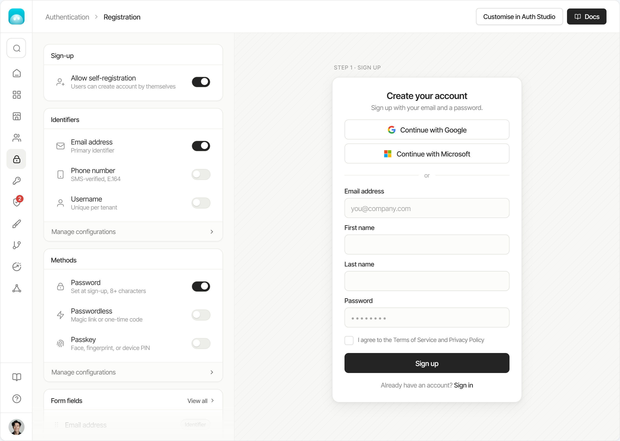
One view where admins configure sign-up and see the result as they work.
The preview answers the question admins used to answer by saving and running the flow. It sits beside the settings and changes as they work: turn on a phone number and the field appears, switch the method and the form follows.
It also steps through the flow, from sign-up to verification, so admins check what users see after they submit and not only the first screen. The result is in front of them while they decide.
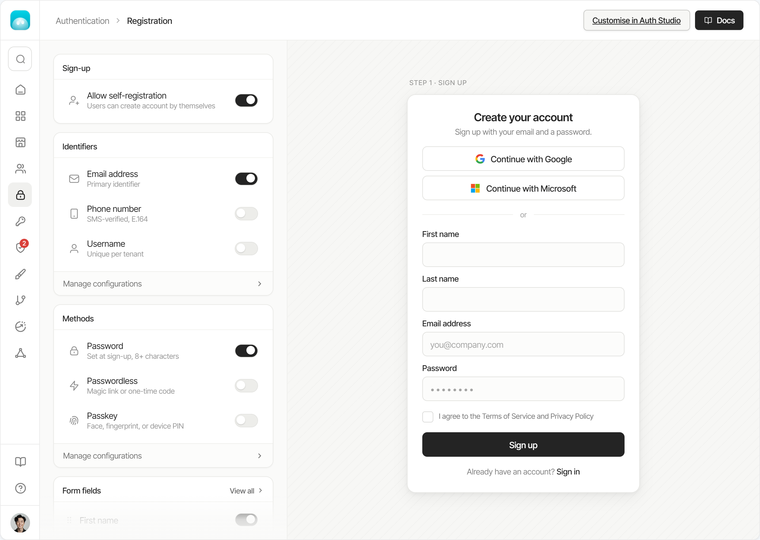
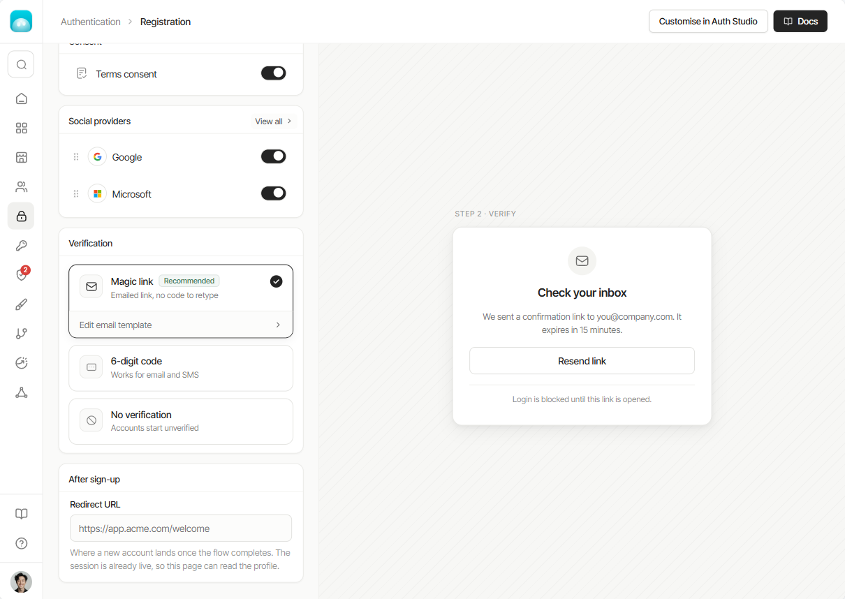
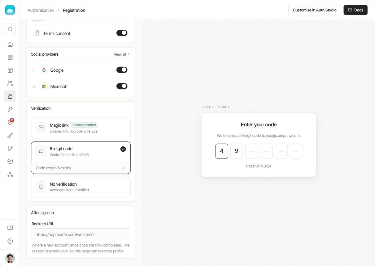
The scattered settings now live in one column, ordered the way an end user meets them: whether people can register at all, which identifiers they sign up with, which methods they authenticate with, and finally the fields on the form.
Each group is a card with its own toggles, so an admin can see what’s on and off without opening anything. Anything that needs more than a toggle sits behind “Manage configurations” on the same card.
Small changes no longer cost extra steps. Each feature’s settings open in a panel on the same page, next to the form they affect. For email, that covers the request limit, the cooldown between emails and how long a link or code stays valid, with a tab for each identifier that is switched on.
The panel has its own Reset and Save changes, and Save stays disabled until something changes. Admins adjust, save and close without leaving the view or losing their place.
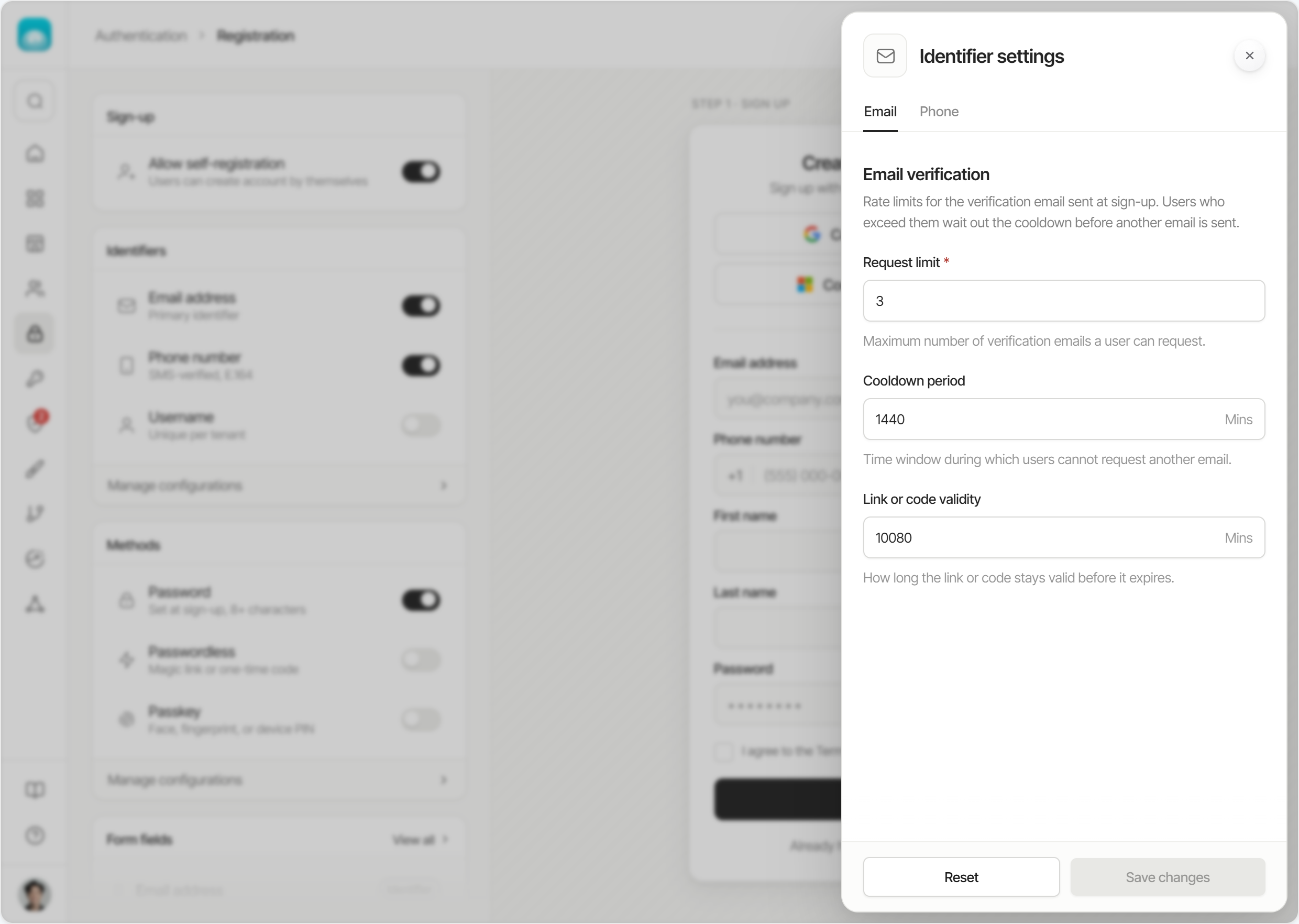
A prototype stakeholders could use, not just look at.
This is the prototype stakeholders used to decide. It isn’t a clickable slideshow: the controls respond, so people could judge the idea by using it, not by reading about it. It runs on sample data, so nothing you change here touches a real account.
I chose a prototype over a specification because the hardest part of this redesign to put into words is the preview reacting as you change a setting. A document would have asked stakeholders to imagine it. Here they could make the changes an admin would make and watch it happen, and we could test and adjust in short loops before anything was built.
I designed and prototyped it using Claude Design. I was responsible for the shared research, information architecture, interaction design and the prototype itself.
Stakeholders backed it, and we know how we will measure it.
The prototype and the testing behind it won stakeholder buy-in to build and ship the redesigned flow in the platform. It isn’t built yet, so I have no usage numbers to share, and I’d rather say so than invent some. What we do have is the KPIs it will be measured against once it ships:
- 1
Time to configure sign-up.Baseline: about 4x longer than on competing platforms.
- 2
Sign-up setup in live demos.Whether Customer Success can configure sign-up in front of a prospect without going back and forth.
- 3
% increase in demo conversions.The share of live demos that convert, tracked after launch against today’s rate.
Good design is buildable, tied to outcomes, and explained to the people who decide.
- 1
Design within the technical limits.Working with an engineer on what our APIs could and couldn’t do meant the prototype showed something we could build. The constraints surfaced while we designed, not after stakeholders had said yes.
- 2
Tie product outcomes to business outcomes.The usability gap only became a business case when I connected it to what it cost us in live demos. A product outcome that moves a business number gives everyone a reason to care and a way to judge the result, which is why the KPIs track setup time and demo conversion together.
- 3
Convey the value of design yourself.A specification asks stakeholders to imagine the flow. A prototype lets them use it. The people who approve a design rarely see its value unprompted, so showing it in a form they can judge is part of the designer’s job.
- 4
Prototype early, because AI made it cheap.I built this demo with Claude Design. When a working prototype is this quick to make, a static mockup stops being the default way to show an idea. The harder skill becomes deciding what is worth prototyping and which question it should answer.